


Your form is complete and now you just need to add the line graph itself to the linked spreadsheet. You will see in your spreadsheet that the header (top) row is filled in with the different events from left to right. Under each column heading add the average =AVERAGE(Range) formula for the cells below, say down to 100 cells below. This will average out the different responses from your form and return a single figure. Don’t worry the survey results should always be added below your average row. I like to add the “Rounded” formatting to these cells as well. Select these average figures and click the “Chart” tool and create a line graph from this data. (These average cells could also be hidden, select the row from the left and click hide row) Find some more detailed steps to making a chart here.
 Group items tagged
1More
Free Technology for Teachers: 11 Good Digital Storytelling Resources - 0 views

1More
Making Online Quizzes with Google Docs - Creating Quizzes | Training & E-Learning Zone ... - 1 views

1More
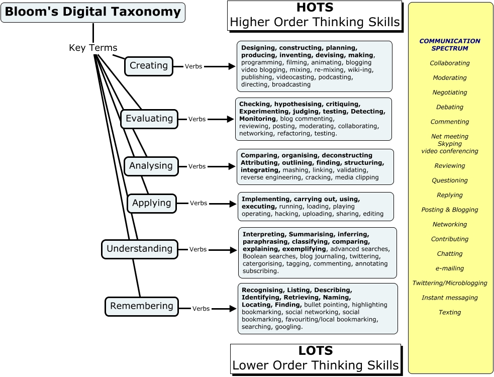
Bloom's_Digital_Taxonomy.jpg (983×750) - 0 views


Ancient Roman Times - 1 views

5More
Why Are We So Afraid of Creativity? | Literally Psyched, Scientific American Blog Network - 1 views
1 - 16 of 16
Showing 20▼ items per page