
Home/ ENGL307: Digital Writing/ Group items tagged the

Rss Feed Group items tagged

Delphine Jackson

Rheotic on the Town (Balance) - 0 views
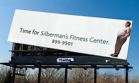
  •  
    JayDax website is developed by a husband wife team, (John and Shelia Chapman) http://www.jaydax.co.uk/lastsupper/lastsupper.htm Rhetorical Analysis: This is a painting of the Last Supper painted by Leonardo Da Vinci. The purpose of this painting is to depicting the scripture in the Gospel of John 13:21,, in the Holy Bible. The targeted audiences are people who are Christians, artist, bible and historian scholars. Understanding the individuals in the painting are biblical, namely Jesus Christ in center of painting establishes a portion of the targeted audience, and the fact that it is a well known painting of Da Vinci establishes the art and historian scholar audience. Design Analysis: The painting is very good example of visual weight. Both symmetrical and asymmetrical balanced are use. Jesus is centered as well as the arch in the center of the table and the apostles are depicted on both sides of Jesus using symmetrical balance. When examining the table setting of the food symmetrical balance is used. Other examples of symmetrical balance are the rear windows, the gridded ceiling. All of these examples convey the definition of symmetrical as history, dignity, and formality. Asymmetrical balance in seen in the arches, one side is colored in and on side white space is used providing contrast and visual weight. Although the panels on the wall are symmetrical the contrast used on the left side provides an unequal, asymmetrical, balance.
Delphine Jackson

lastsupper - 0 views

shared by Delphine Jackson on 27 Sep 11 - No Cached
  •  
    JayDax website is developed by a husband wife team, (John and Shelia Chapman) http://www.jaydax.co.uk/lastsupper/lastsupper.htm Rhetorical Analysis: This is a painting of the Last Supper painted by Leonardo Da Vinci. The purpose of this painting is to depicting the scripture in the Gospel of John 13:21,, in the Holy Bible. The targeted audiences are people who are Christians, artist, bible and historian scholars. Understanding the individuals in the painting are biblical, namely Jesus Christ in center of painting establishes a portion of the targeted audience, and the fact that it is a well known painting of Da Vinci establishes the art and historian scholar audience. Design Analysis: The painting is very good example of visual weight. Both symmetrical and asymmetrical balanced are use. Jesus is centered as well as the arch in the center of the table and the apostles are depicted on both sides of Jesus using symmetrical balance. When examining the table setting of the food symmetrical balance is used. Other examples of symmetrical balance are the rear windows, the gridded ceiling. All of these examples convey the definition of symmetrical as history, dignity, and formality. Asymmetrical balance in seen in the arches, one side is colored in and on side white space is used providing contrast and visual weight. Although the panels on the wall are symmetrical the contrast used on the left side provides an unequal, asymmetrical, balance.
Meaghan Barnes

Fitness Center - 0 views

  •  
    The viewer's eyes are at first drawn to the left because the ad looks off the billboard, but then the reader sees the name of the fitness center which leads to the overweight gentleman on the right of the ad. Follows natural flow of left to right.
Bianca Rawlings

How To Change Your WordPress Workflow For The Better | Wptuts+ - 0 views

  •  
    Homework, WordPress: A more organizational approach to improving your WordPress, including a focus on the calendar feature, pre-publishing, custom statuses, editing and notifications. All of the changes directly relate to making the WordPress more easily accessible and easier to navigate. The focus is more-so on the functionality of the aesthetic than just the aesthetic itself, which makes the WordPress both easy to follow the flow of and interesting to look at.
Derek Thomas

17 Examples of Beautiful Typography in Web Design | Inspiration - 0 views

  •  
    This website shows off some of the best examples of how typography can be used in web design. My favorite is the Evenglide Showroom image. I love the clean look of the type and the way it fits in perfectly with the image. The text does not take away anything from the image which is a difficult thing to accomplish. I have seen typography detract from images in the past, but this is a wonderful example of it adding to an image.
chris bittner

What is New Media? - YouTube - 0 views

  •  
    This is a really good video about what new media is and what it means to us in general terms.
  • ...6 more comments...
  •  
    This is a new media approach at explaining new media. This video shows how to create new media, and explains what new media is. It questions the difference between new and old media information. It explains the only difference is the audience.
  •  
    A new media discussion video that compares the paradigms between old media and new media and how the audience interacts
  •  
    I like this video because he gives a basic definition to new media. The video is really weird, but it is helpful. He gives examples of what new media is composed of.
  •  
    This video was not only informative but it was intertaining. Researching information on New Media was not to exciting, this video got your attention and kept it. It also explains it in a simple, easily understood way.
  •  
    Some schmuck on Youtube argues that the main thing distinguishing new media is interactivity.
  •  
    This video was a very good tutorial on learning the importance of new media.
  •  
    This man really displayed the importance of new media. He accurately defined the material and was extremely persuasive with his view on the critical nature of it.
  •  
    This man really displayed the importance of new media. He accurately defined the material and was extremely persuasive with his view on the critical nature of it.
Meaghan Barnes

554487_371438202910851_2084453066_n.jpg (700×630) - 0 views

  •  
    Contrast in advertising.  The background of the image is black which of course is going to mean that anything on the foreground will be easily seen.  The product, which is the nail polish, is a bright red which stands out.  The name of the product "Dior" is in a bold white lettering at the bottom.
Klaira Batten

History of the Internet - YouTube - 0 views

  •  
    This you tube video describes the history of the internet. This video shows the interesting development of the internet over the years.
  •  
    A little documentary that explains some of the things we read about in other articles but includes animations and expounds upon the history of the internet. I enjoyed the visuals with the information.
Jasmine Madison

The Influencing Machine: Brooke Gladstone on the Media on Vimeo - 0 views

  •  
    This video is an automated short of one of the parts of Brooke Gladstone's book, The Influencing Machine. It is identical to the scene in the book but the added audio and animation made me understand the meaning and feeling behind the scene much more.
Michelle Reedy

▶ GlamoDesign Website Design Process - YouTube - 0 views

  •  
    This youtube video relates to Chapter 2 which focuses on the design process and the steps involved. Although this video is slightly different from the steps stated in the textbook, it kind of goes into more detail of the steps given in the text book and gives a nice visual of the steps involved in creating a webpage and how it will look on multiple media devices.
Stephanie Bingham

Aleppo in Syria: No Internet - 0 views

  •  
    Not only does this article help us stay informed about the events that are taking place in Syria, but it also demonstrates that the access to the Internet really is more than turning on a computer. A vast network is necessary to keep connected to the area and when this network becomes interrupted it can cause an entire city, even some of the biggest, to lose their connection to the online world.
Eric Guy

50 years after MLK, Obama delivers predictable rhetoric against a historic backdrop - T... - 0 views

  •  
    After having read the first two chapters of the Designed Fundamentals for New Media book and the other required readings, I feel I was better equipped in regards to being able to identify the different methods of communication present, and understand why the author of the article referred to Obama's rhetoric as "predictable."
Marta Quero

design principles - How important is the visual flow of an interface? - Graphic Design ... - 0 views

  •  
    The visual flow of an interface does matter, and here's why: Every interface screen should have a primary action or actions that are to be performed. The visual flow should naturally draw the eye to the primary action. << This resource explains why visual flow matters. 
  •  
    "The visual flow should naturally draw the eye to the primary action."
Meaghan Barnes

London-Olympic-2012-Ads-5.jpg (600×399) - 0 views

  •  
    Balance used in advertising.  The coke bottles increase and then decrease in size; the largest being in the middle. Folding the ad in half results in the same amount of bottles being seen on each half.  The same couple colors are used without giving it a uniform, balanced feel
Meaghan Barnes

0212.jpg (300×400) - 0 views

  •  
    The covers on all magazines follow a type of repetition.  The title is always located at the top and centered.  Then along the left and right of the image there are "top" article names to draw the readers in
Derek Thomas

Remediation - Understanding New Media - Revisiting a Classic - 0 views

  •  
    Remediation is used in music to refashion live versions of media. The live version is recreated and multiplied, creating a studio and synthesized final version of the product.
  •  
    This website provided a great run down on the book Remediation and the theory behind it. It was a great supplement to the reading and really helped me further my understanding of it. Remediation is something that is constantly going on around us, and is very important to understand. It is the driving force for the progress of our media.
Amy Lucas

Ethos, Pathos, and Logos - 0 views

  •  
    This website goes over ethos, pathos, and logos. It helps me understand the readings better because it gives several examples of each concept. Ethos is ethical appeal that the author uses. Pathos is when the author trying to appeal to the readers emotions. Logos is the logic portion of writing that will begin to make sense to the reader.
Eric Guy

Purdue OWL: Introduction to Rhetoric - YouTube - 0 views

  •  
    Watching this video, which was linked within the introduction to rhetoric on the Purdue OWL site, helped me become cognizant of the origins of rhetoric and the historical background of the skill. It's a very good primer before diving into the readings.
Shannon Tolbert

HowStuffWorks "Internet vs. World Wide Web" - 0 views

  •  
    This site explains the different in the internet and the world wide web. I found this site to be very helpful to me in identifying the difference in the internet and the world wide web.
Amy Lucas

▶ Positive and Negative Space - YouTube - 0 views

  •  
    This video on you tube gives a couple of explanations and examples of positive and negative space. It helped me better understand the material because I was able to see the examples and hear the voiceover explain what the negative and positive space is.
  •  
    This video on you tube gives a couple of explanations and examples of positive and negative space. It helped me better understand the material because I was able to see the examples and hear the voiceover explain what the negative and positive space is.
1 - 20 of 501 Next › Last »
Showing 20 items per page