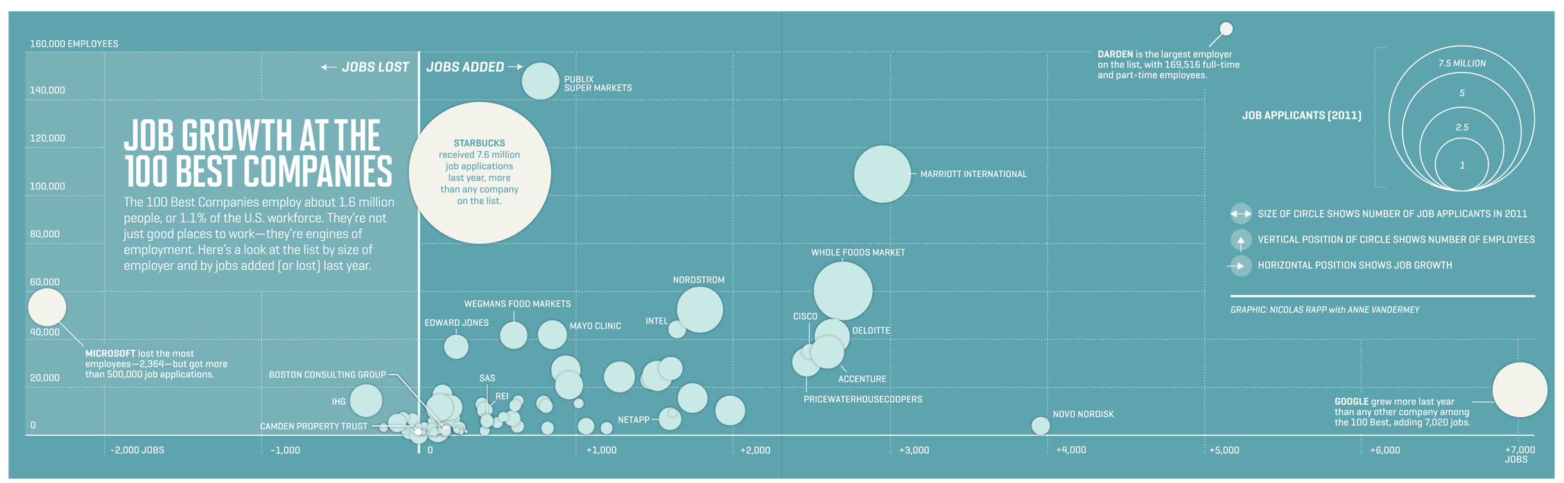
Compares the voted top 100 companies via jobs applications, current number of employees, and amount of jobs created/lost. Overall it is a fairly simple graphic but is interesting to see how these companies compare
anyqs
This is a beautiful relative comparison graph. However, it would still be better to see all the companies losing a percentage of their workforce instead of just the number. This would show a better representation of decline or prosperity of a company. for example, is microsoft facing the recession more than anyone else, or did they simply have too many employees before
anyqs
This is a nice graph, especially in that it compares multiple variables. One question I have though is who voted on these best companies? What was their definition of best? Also, this is pretty technical, but is the center of the circle or the top of the circle even with the total number of employees?
This would probably be an axiomatic notion of probability, as it places the approval of past presidents with the current president. If it were taken from the perspective of whether or not President Obama will be elected for a second term, though, it could be seen as subjective probability statistics.

 Graham Gaylor on 05 Apr 12What does it take to get a job at Google Infographic
 Group items tagged


