This website lists repetition as being one of the 4 principles of good designs for websites. This shows how useful repetition can be when used in the creation of a website. It is a fundamental tool that should be used by designers when appropriate.
I like this resource because it moves beyond the "whats" of repetition and rhythm and analyzes the real world effects it has and can be used for. (10/15)
This You Tube video gives a tutorial of rhythm and repetition. It is very helpful because it explains the different elements and how they are used in the image to create rhythm and repetition.
A 13 part lesson on repetition by Natomas High School Design Department with examples of everyday materials we read and write such as invitations and resumes.
"Graphic design contains underlying principles that govern the most important aspects of great design. These principles create the acronym C.R.A.P. which stands for contrast, repetition, alignment, and proximity." This link provides both good written examples and picture examples.
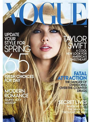
The covers on all magazines follow a type of repetition. The title is always located at the top and centered. Then along the left and right of the image there are "top" article names to draw the readers in
I like what the person in this video said about repetition. For example, mentions to give your project some variety by moving some parts of your project around. Or you could give it a new color or texture in order for it to catch the audiences eye.
Chapter 6, Repetition: An analysis of contrast, repetition, alignment, and proximity with examples of each in the form of website design. This shows how they all work in harmony and how they impact the design element of a website.
This is a copy of pages from a presentation that talks about the repitition element and other design elements that we have discussed in class. These pages are very informative and provides some good examples.

 Mitchell Black on 16 Oct 12this website goes over all the elements of design. Probably the coolest part to me is the amount of repetition they use in each description.
 Group items tagged


