This website gives more in depth information about the design concept of balance. It gives several examples of balance with an explanation of how a particular image is balanced. This website is useful because of the examples it gives since the concept of balance is somewhat confusing.
An old picture that exemplifies both perspective and balance. I thought it was really cool that even old pictures follow the same rules that we learn today.
I like what the person in this video said about repetition. For example, mentions to give your project some variety by moving some parts of your project around. Or you could give it a new color or texture in order for it to catch the audiences eye.
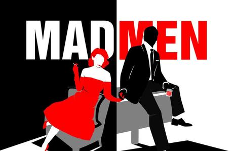
Contrasting in advertising. Serious use of contrast in this ad. The left side of the ad is completely different from the right side. The women is red whereas the man is black. "Mad" is white and "men" is red.
Contrast in advertising. The background of the image is black which of course is going to mean that anything on the foreground will be easily seen. The product, which is the nail polish, is a bright red which stands out. The name of the product "Dior" is in a bold white lettering at the bottom.
Alignment used on business cards. The telephone and email addresses are clumped together with the name and the title of the person separated in the middle.
This page contains three basic guidelines for making effective color choices that work for nearly everyone. << In order to understand contrast, you've gotta understand how it works, right!
People are physically, psychologically, and socially influenced by color. Color has been found to have connections to health and it can help set the mood through which your designs are seen. << how color and contrast are beneficial to design.


 Jennifer Elks on 10 Oct 13This gives a great definition of interactivity


