You may or may not be aware but alignment is such an integral part of most website design that you probably do not even realize it is there; it sits in the background, hidden as an initial design element. << Reinforces that alignment is more important than it seems.
People are physically, psychologically, and socially influenced by color. Color has been found to have connections to health and it can help set the mood through which your designs are seen. << how color and contrast are beneficial to design.
This page contains three basic guidelines for making effective color choices that work for nearly everyone. << In order to understand contrast, you've gotta understand how it works, right!
Alignment used on business cards. The telephone and email addresses are clumped together with the name and the title of the person separated in the middle.
Contrast in advertising. The background of the image is black which of course is going to mean that anything on the foreground will be easily seen. The product, which is the nail polish, is a bright red which stands out. The name of the product "Dior" is in a bold white lettering at the bottom.
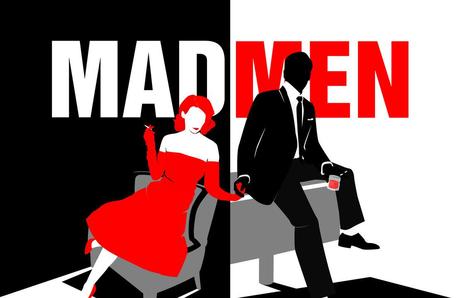
Contrasting in advertising. Serious use of contrast in this ad. The left side of the ad is completely different from the right side. The women is red whereas the man is black. "Mad" is white and "men" is red.
"Alignment is another way of creating associations between visual elements, which help users quickly understand the relationships of objects on a page."
Alignment is the adjustment of an object in relation with other objects (wikipedia). You are aware of left alignment (often called left justify) and right alignment. By alignment here, we mean the way every element is positioned in comparison to the other element


 Janae Cherry on 07 Nov 12How social media changes the way we are viewed online


