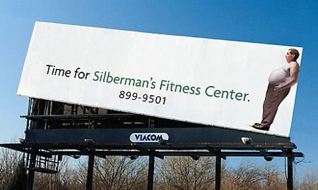
The viewer's eyes are at first drawn to the left because the ad looks off the billboard, but then the reader sees the name of the fitness center which leads to the overweight gentleman on the right of the ad. Follows natural flow of left to right.
Ch 3 BOD- Contrast
This site talks about contrast form a web designer's perspective. It breaks down contrast into elements of size, classification, color, cases,style and decoration, weight and space.
Homework, WordPress: A more organizational approach to improving your WordPress, including a focus on the calendar feature, pre-publishing, custom statuses, editing and notifications. All of the changes directly relate to making the WordPress more easily accessible and easier to navigate. The focus is more-so on the functionality of the aesthetic than just the aesthetic itself, which makes the WordPress both easy to follow the flow of and interesting to look at.
This is a really simple, yet effective, example of how repeating layouts, fonts, and colors throughout a web page can be beneficial to organization and flow.

 Keya Murphy on 23 Oct 11This is a really good page that gives good breakdowns and good examples of flow.
 Group items tagged


